Liquidity Sweep Scanner [TradingFinder]🔵 Introduction
Recognizing how liquidity develops and how price reacts at key structural levels is critical for spotting precise, low-risk trade entries. The Liquidity Sweep Scanner is an advanced tool built to track market activity in real time, pinpoint liquidity sweeps, define reaction zones, and identify confirmation candles across multiple instruments and timeframes.
Key Advantages :
Detects high-probability reversal points with precision.
Combines liquidity analysis, market structure, and candle confirmation.
Works seamlessly across multiple symbols and timeframes.
This screener can scan a broad watchlist or analyze every timeframe of a single asset to find optimal reversal zones. It starts by identifying a clear swing point either a swing high or swing low and marking a reaction zone between that point and the candle’s highest or lowest open/close value.
If price revisits the zone, performs a liquidity grab, and forms an indecision candle such as a doji or narrow-bodied bar that closes inside the zone, this may indicate rejection of the level and a failed breakout attempt. Based on the surrounding market context, the screener then flags a potential bullish or bearish reversal and generates the appropriate Long or Short signal.
By focusing on precise entry timing, institutional order flow alignment, and filtering out false breakouts, the Liquidity Sweep Scanner zeroes in on the market areas where liquidity engineering, reversal potential, and inefficiency overlap. This makes it an indispensable tool for price action traders who rely on clear, high-quality setups without the distraction of market noise.
🔵 How to Use
The Liquidity Sweep Scanner continuously evaluates market structure, issuing alerts when a potential reversal setup emerges. It merges liquidity behavior, swing point analysis, and candle confirmation within predefined reaction zones.
To illustrate, imagine price forms a swing high or low, then later returns to that level. If it sweeps the prior extreme and produces a qualifying candle inside the reaction zone, the tool signals a possible reversal.
🟣 Long Setup
For a bullish scenario, the screener first spots a valid swing low a level often packed with sell-side liquidity. From there, it defines a reaction zone stretching from the swing low to the candle’s lowest open/close point.
If price retests this area with a wick dipping below the swing low but then closes back inside the zone, it signals absorption of selling pressure and rejection of further downside. The screener then awaits a confirmation candle commonly a doji or small-bodied bar closing inside the zone. Once these conditions align, a Long signal is logged and, if alerts are active, the trader receives a notification.
🟣 Short Setup
For bearish opportunities, the process begins by locating a valid swing high typically an area dense with buy-side liquidity. The reaction zone is drawn from the swing high to the candle’s highest open/close value.
When price retests this zone, sweeps above the swing high, and fails to close higher, it suggests a bull trap and waning upward momentum. The screener then requires a confirmation candle often a doji or rejection bar that closes back within the zone before confirming a Short signal.
These bearish setups help traders pinpoint likely institutional sell zones, offering a clear view of where price may reverse following a liquidity event.
🔵 Settings
🟣 Logical settings
Liquidity Swing period : You can set the swing detection period.
Market Structure Period :You can set the Pivot Period to determine the detection direction.
Max Swing Back Method : It is in two modes "All" and "Custom". If it is in "All" mode, it will check all swings, and if it is in "Custom" mode, it will check the swings to the extent you determine.
Max Swing Back : You can set the number of swings that will go back for checking.
Maximum Distance Between Swing and Signal : The maximum number of candles allowed between the swing point and the potential signal. The default value is 50, ensuring that only recent and relevant price reactions are considered valid.
🟣 Display Settings
Table on Chart : Allows users to choose the position of the signal dashboard either directly on the chart or below it, depending on their layout preference.
Number of Symbols : Enables users to control how many symbols are displayed in the screener table, from 10 to 20, adjustable in increments of 2 symbols for flexible screening depth.
Table Mode : This setting offers two layout styles for the signal table :
Basic : Mode displays symbols in a single column, using more vertical space.
Extended : Mode arranges symbols in pairs side-by-side, optimizing screen space with a more compact view.
Table Size : Lets you adjust the table’s visual size with options such as: auto, tiny, small, normal, large, huge.
Table Position : Sets the screen location of the table. Choose from 9 possible positions, combining vertical (top, middle, bottom) and horizontal (left, center, right) alignments.
🟣 Symbol Settings
Each of the 10 symbol slots comes with a full set of customizable parameters :
Symbol : Define or select the asset (e.g., XAUUSD, BTCUSD, EURUSD, etc.).
Timeframe : Set your desired timeframe for each symbol (e.g., 15, 60, 240, 1D).
🟣 Alert Settings
Alert : Enables alerts for LSS.
Message Frequency : Determines the frequency of alerts. Options include 'All' (every function call), 'Once Per Bar' (first call within the bar), and 'Once Per Bar Close' (final script execution of the real-time bar). Default is 'Once per Bar'.
Show Alert Time by Time Zone : Configures the time zone for alert messages. Default is 'UTC'.
🔵 Conclusion
The Liquidity Sweep Scanner equips traders with a precise, structured method for spotting high-probability reversals by merging liquidity sweeps, reaction zone mapping, and candle confirmation.
It not only filters out market noise but also highlights price areas where inefficiency and reversal potential align. Beyond identifying clean entry points, the tool includes a market direction detection feature allowing traders to quickly determine the prevailing trend and align their trades accordingly.
With adjustable settings such as the Pivot Period for fine-tuning detection direction, it adapts to various trading styles and timeframes, making it a powerful and versatile addition to any trader’s strategy.
In den Scripts nach " TABLE " suchen

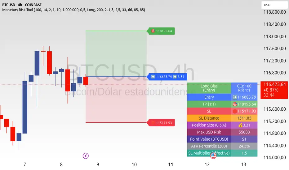
ATR+CCI Monetary Risk Tool - TP/SL⚙️ ATR+CCI Monetary Risk Tool — Volatility-aware TP/SL & Position Sizing
Exact prices (no rounding), ATR-percentile dynamic stops, and risk-budget sizing for consistent execution.
🧠 What this indicator is
A risk-first planning tool. It doesn’t generate orders; it gives you clean, objective levels (Entry, SL, TP) and position size derived from your risk budget. It shows only the latest setup to keep charts readable, and a compact on-chart table summarizing the numbers you actually act on.
✨ What makes it different
Dynamic SL by regime (ATR percentile): Instead of a fixed multiple, the SL multiplier adapts to the current volatility percentile (low / medium / high). That helps avoid tight stops in noisy markets and over-wide stops in quiet markets.
Risk budgeting, not guesswork: Size is computed from Account Balance × Max Risk % divided by SL distance × point value. You risk the same dollars across assets/timeframes.
Precision that matches your instrument: Entry, TP, SL, and SL Distance are displayed as exact prices (no rounding), truncated to syminfo.mintick so they align with broker/exchange precision.
Symbol-aware point value: Uses syminfo.pointvalue so you don’t maintain tick tables.
Non-repaint option: Work from closed bars to keep the plan stable.
🔧 How to use (quick start)
Add to chart and pick your timeframe and symbol.
In settings:
Set Account Balance (USD) and Max Risk per Trade (%).
Choose R:R (1:1 … 1:5).
Pick ATR Period and CCI Period (defaults are sensible).
Keep Dynamic ATR ON to adapt SL by regime.
Keep Use closed-bar values ON to avoid repaint when planning.
Read the labels (Entry/TP/SL) and the table (SL Distance, Position Size, Max USD Risk, ATR Percentile, effective SL Mult).
Combine with your entry trigger (price action, levels, momentum, etc.). This indicator handles risk & targets.
📐 How levels are computed
Bias: CCI ≥ 0 ⇒ long, otherwise short.
ATR Percentile: Percent rank of ATR(atrPeriod) over a lookback window.
Effective SL Mult:
If percentile < Low threshold ⇒ use Low SL Mult (tighter).
If between thresholds ⇒ use Base SL Mult.
If percentile > High threshold ⇒ use High SL Mult (wider).
Stop-Loss: SL = Entry ± ATR × SL_Mult (minus for long, plus for short).
Take-Profit: TP = Entry ± (Entry − SL) × R (R from the R:R dropdown).
Position Size:
USD Risk = Balance × Risk%
Contracts = USD Risk ÷ (|Entry − SL| × PointValue)
For futures, quantity is floored to whole contracts.
Exact prices: Entry/TP/SL and SL Distance are not rounded; they’re truncated to mintick so what you see matches valid price increments.
📊 What you’ll see on chart
Latest Entry (blue), TP (green), SL (red) with labels (optional emojis: ➡️ 🎯 🛑).
Info Table with:
Bias, Entry, TP, SL (exact, truncated to mintick)
SL Distance (exact, truncated)
Position Size (contracts/units)
Max USD Risk
Point Value
ATR Percentile and effective SL Mult
🧪 Practical examples
High-volatility session (e.g., XAUUSD, 1H): ATR percentile is high ⇒ wider SL, smaller size. Reduces churn from normal noise during macro events.
Range-bound market (e.g., EURUSD, 4H): ATR percentile low ⇒ tighter SL, better R:R. Helps you avoid carrying unnecessary risk.
Index swing planning (e.g., ES1!, Daily): Non-repaint levels + risk budgeting = consistent sizing across days/weeks, easier to review and journal.
🧭 Why traders should use it
Consistency: Same dollar risk regardless of instrument or volatility regime.
Clarity: One-trade view forces focus; you see the numbers that matter.
Adaptivity: Stops calibrated to the market’s current behavior, not last month’s.
Discipline: A visible checklist (SL distance, size, USD risk) before you hit buy/sell.
🔧 Input guide (practical defaults)
CCI Period: 100 by default; use as a bias filter, not an entry signal.
ATR Period: 14 by default; raise for smoother, lower for more reactive.
ATR Percentile Lookback: 200 by default (stable regime detection).
Percentile thresholds: 33/66 by default; widen the gap to change how often regimes switch.
SL Mults: Start ~1.5 / 2.0 / 2.5 (low/base/high). Tune by asset.
Risk % per trade: Common pro ranges are 0.25–1.0%; adjust to your risk tolerance.
R:R: Start with 1:2 or 1:3 for balanced skew; adapt to strategy edge.
Closed-bar values: Keep ON for planning/live; turn OFF only for exploration.
💡 Best practices
Combine with your entry logic (structure, momentum, liquidity levels).
Review ATR percentile and effective SL Mult across sessions so you understand regime shifts.
For futures, remember size is floored to whole contracts—safer by design.
Journal trades with the table snapshot to improve risk discipline over time.
⚠️ Notes & limitations
This is not a strategy; it does not place orders or alerts.
No slippage/commissions modeled here; build a strategy() version for backtests that mirror your broker/exchange.
Displayed non-price metrics use two decimals; prices and SL Distance are exact (truncated to mintick).
📎 Disclaimer
For educational purposes only. Not financial advice. Markets involve risk. Test thoroughly before trading live.
BB Opening Range
Master session-based trading with precision range analysis and dynamic extensions
📊 Overview
The BB Opening Range Indicator is a comprehensive session analysis tool that captures, visualizes, and extends price ranges for any defined trading session. Whether you're tracking overnight ranges, opening ranges, or custom session periods, this indicator provides institutional-grade visualization with intelligent range extensions and detailed quadrant analysis.
🎯 Key Features
Dynamic Session Tracking
Define custom session times (default: Midnight 00:00-00:30)
Automatic timezone adjustment for precise session detection
Handles sessions that cross midnight seamlessly
Visual session start/end markers with customizable lines
Intelligent Range Extension
Futures Close (17:00) - Extends ranges until 5:00 PM ET
End of Week - Maintains ranges through Friday close
Always - Continuous extension for persistent levels
Session End Only - Basic range without extension
Advanced Quadrant Analysis
Automatically divides ranges into four equal zones (0-25%, 25-50%, 50-75%, 75-100%)
Color-coded quadrants for instant visual reference
Optional quadrant border lines at 25%, 50%, and 75% levels
Customizable colors and opacity for each quadrant
Historical Range Analytics
Tracks multiple historical ranges (configurable 1-50)
Calculates average range size over customizable lookback period (up to 200 days)
Compares current range to historical average
Maintains clean chart with automatic old range cleanup
Professional Visualization
Clean, institutional-style range boxes with customizable borders
Opening price line overlay
Optional info table showing key levels and statistics
Smart label positioning that follows price action
Predictive next session indicator
📈 Use Cases
Opening Range Breakout Trading
Track the first 30-60 minutes of regular trading hours to identify key support/resistance levels for the day.
Overnight Range Analysis
Monitor overnight/globex sessions to gauge pre-market sentiment and identify potential gaps.
Custom Session Ranges
Define any time period relevant to your strategy - London open, New York open, Asian session, or custom intervals.
Multi-Timeframe Analysis
View how price respects historical session ranges across different timeframes for confluence.
⚙️ Settings Guide
Session Settings
Session Name: Label your session for easy identification
Session Time: Define start and end times (24-hour format)
Extend Until: Choose how long ranges remain visible
Lookback Days: Period for calculating average range size
Max Ranges: Number of historical ranges to display
Display Options
Show Quadrants: Toggle quadrant visualization
Show Info Table: Display statistics table
Table Position: Choose table location on chart
Session Lines: Show/hide session start and next session markers
Open Price Line: Display opening price within range
Label Settings
High/Low Labels: Show range extremes
Quadrant Labels: Display 25%, 50%, 75% levels
Open Price Label: Mark session opening price
Current Range Only: Limit labels to most recent range
Visual Styling
Border Settings: Customize box and quadrant borders
Line Widths: Adjust border and quadrant line thickness
Color Scheme: Full control over all visual elements
NightWatch 24/5 [theUltimator5]NightWatch 24/5 is a comprehensive indicator designed to seamlessly display both regular and overnight trading (BOATS exchange) into a single chart. Current TV limitations don't allow both overnight trading and regular exchanges to appear on the same chart due to timeframe visibility settings. We can either select between RTH (Regular Trading Hours) or ETH (Extended Trading Hours). There is no option to show 24 hour charts when looking at a stock. This indicator attempts to solve this issue.
Please read the entire description thoroughly because this indicator takes a little bit of setup to work properly!
---IMPORTANT-- -
This indicator MUST be used over a liquid cryptocurrency chart, like Bitcoin. It requires access to something that trades 24/7 and has volume data for all periods. Bitcoin on Coinbase is the best option. Please select Bitcoin as your main ticker before adding this indicator to the chart.
-------------------
This indicator combines the price of both the regular trading hours and the overnight trading to create a single price line and volume candles. You can select view settings to either overlay the price on the chart, or have it below the chart. Volume can be toggled on or off as well.
Default settings:
Ticker = GME
Overlay Candles on Main Chart = true
Display Data = Both Price and Volume
Show Status Table = true
Here is an explanation for each of these settings:
Ticker - Type in the ticker you want to track overnight and intraday data for
Overlay Candles on Main chart - This will push the price candles onto the main chart area instead of below it. Volume candles will remain in their own separate pane below. This is useful if you want to track both price and volume without adding the indicator twice.
Display Data - This determines what data to show. Volume, price, or both volume and price.
Show Status Table - This toggles on or off the table that shows the ticker name, current session, and the price (change) of the ticker since the most recent daily close.
If you overlay the price onto the chart, the price of the stock you are looking at will likely be a VERY different price than the crypto it is overlaying against. There are a couple workarounds. You can either zoom into the chart around the price of the stock you are looking at (time consuming), or you can go into your object tree and drag the indicator up into the main chart area. This will overlay the price onto the crypto while maintaining it's own unique y-axis.
After you move the indicator up, you can add the indicator back a second time, then change the settings to only show the volume candles. You can then toggle off the table on one of the two so you don't see duplicate tables. This is the setting I am showing in my chart above. The indicator is added twice with the price being pulled up into the same window as Bitcoin, then a second instance below showing just volume.
--LIMITATIONS--
Since the indicator requires the use of a 24 hour market ticker like Bitcoin, it DOES NOT display extended hours data. The price and volume data STOPS at 16:00 EST then resumes back up at 20:00 EST when BOATS opens. At 04:00, the price and volume then stops until 09:30, when the regular trading hours begin. This causes a flat line in the price during those periods. Unfortunately, there is no current workaround to this issue.
If Bitcoin becomes illiquid (or whatever crypto you choose), it will only populate data for the ticker you want if there is data available for that crypto at the same time period. A gap in Bitcoin volume will show a gap in trade activity for your ticker.
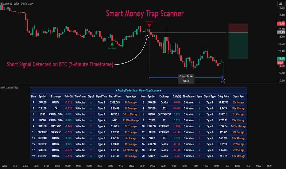
Smart Money Trap Scanner [TradingFinder]🔵 Introduction
In many market conditions, what initially seems to be a decisive breakout often turns out to be nothing more than a false breakout or fake move. Price breaks through a significant structural level, such as a swing high or low or a key support and resistance zone, only to quickly return to its previous range. These moves, often driven by liquidity traps or market manipulation, typically signal structural weakness rather than the start of a new trend.
This screener is specifically designed to detect such situations. It focuses on identifying false breakouts and price returns to broken levels within a defined time window, and then looks for retracements into the Fibonacci zone. If price reenters the 0.618 to 1.0 retracement area and aligns with the time-based filters, the system flags a low-risk, high-probability entry opportunity.
To enhance the precision of signal detection, the screener categorizes setups into two distinct types based on the speed of the price reaction after a breakout. Type A signals occur when the price breaks a level and immediately returns to break-even within the very next candle indicating a sharp rejection and rapid invalidation of the breakout. In contrast, Type B signals involve a more gradual return to the broken level, typically taking between two to five candles. This differentiation allows traders to better assess the context and urgency of each trap, providing a clearer understanding of momentum and liquidity behavior behind the move.
Additionally, the screener includes a Signal Age feature, which displays how much time has passed since the last valid signal was generated. This allows traders to quickly assess signal freshness and avoid acting on outdated setups, especially in fast-moving market environments.
One of the key advantages of this tool is its ability to simultaneously scan multiple symbols and timeframes. It only triggers an alert when all conditions false breakout, structural return, and Fibonacci alignment are met. This allows traders to bypass the need for manually reviewing dozens of charts and instead concentrate on clean, valid, and structure-based setups with greater precision.
🔵 How to Use
This tool operates as a structure-based screener that continuously scans various symbols and timeframes. By combining price behavior analysis, structural breakout detection, and Fibonacci retracement zones, it only signals entries when the probability of reversal is significantly supported by liquidity logic and price correction depth.
The system doesn’t just monitor price movements beyond key levels like swing highs or lows. It also evaluates whether the move quickly reverses and absorbs liquidity. If so, Fibonacci is applied to measure the depth of the pullback and identify the most favorable entry zones.
🟣 Long Signal
A long setup is triggered when price temporarily breaks below a valid structural support or swing low. This initial move is typically designed to trigger stop losses and collect sell-side liquidity. If price returns to the broken level within five candles, it is considered a false breakout.
At this point, Fibonacci is drawn from the recent swing high to the new low. If price enters the 0.618 to 1.0 retracement zone within the next ten candles, a potential long entry aligned with Smart Money logic is activated. This deep retracement zone often offers the best low-risk entry, as it typically marks the area where liquidity has been absorbed and the breakout structure has failed.
The stop loss is placed slightly below the 1.0 level to account for minor fluctuations, while the target is set based on trend structure or risk-reward preferences.
🟣 Short Signal
A short setup begins with price temporarily breaking above a valid resistance or swing high. This breakout is often driven by buy-side liquidity collection or stop hunting. If price returns to the broken level within five candles, the move is marked as a breakout failure.
Fibonacci is then drawn from the recent swing low to the new high. If price enters the 0.618 to 1.0 zone within ten candles after the return, a short opportunity is confirmed. This area usually represents the maximum acceptable retracement before a continuation move to the downside and often triggers strong reactions.
The stop loss is placed just above the 1.0 level, and the target is defined based on the expected structure of the move or a predetermined reward ratio.
🟡 Advantages of the Screener
Unlike manual approaches that require constant monitoring of multiple charts, this tool functions as a fully automated screener across multiple symbols and timeframes. It continuously evaluates key levels, liquidity reactions, structural returns, and Fibonacci zones. An alert is only generated when all necessary conditions are met with high accuracy.
This ensures that traders avoid risky or misleading entries and stay focused on precise, verified, and logic-based setups — saving time, reducing noise, and improving consistency in decision-making.
🔵 Settings
🟣 Logical settings
Swing period : You can set the swing detection period.
Valid After Trigger Bars : Limits how many candles after a fake breakout the entry zone remains valid.
Max Swing Back Method : It is in two modes "All" and "Custom". If it is in "All" mode, it will check all swings, and if it is in "Custom" mode, it will check the swings to the extent you determine.
Max Swing Back : You can set the number of swings that will go back for checking.
🟣 Display Settings
Table on Chart : Allows users to choose the position of the signal dashboard either directly on the chart or below it, depending on their layout preference.
Number of Symbols : Enables users to control how many symbols are displayed in the screener table, from 10 to 20, adjustable in increments of 2 symbols for flexible screening depth.
Table Mode : This setting offers two layout styles for the signal table :
Basic : Mode displays symbols in a single column, using more vertical space.
Extended : Mode arranges symbols in pairs side-by-side, optimizing screen space with a more compact view.
Table Size : Lets you adjust the table’s visual size with options such as: auto, tiny, small, normal, large, huge.
Table Position : Sets the screen location of the table. Choose from 9 possible positions, combining vertical (top, middle, bottom) and horizontal (left, center, right) alignments.
🟣 Symbol Settings
Each of the 10 symbol slots comes with a full set of customizable parameters :
Symbol : Define or select the asset (e.g., XAUUSD, BTCUSD, EURUSD, etc.).
Timeframe : Set your desired timeframe for each symbol (e.g., 15, 60, 240, 1D).
🟣 Alert Settings
Alert : Enables alerts for SMT Screener.
Message Frequency : Determines the frequency of alerts. Options include 'All' (every function call), 'Once Per Bar' (first call within the bar), and 'Once Per Bar Close' (final script execution of the real-time bar). Default is 'Once per Bar'.
Show Alert Time by Time Zone : Configures the time zone for alert messages. Default is 'UTC'.
🔵 Conclusion
Many trading mistakes stem from misinterpreting price breaks and entering too early into deceptive moves. In a market environment where false breakouts, liquidity traps, and engineered movements are increasingly common, having a tool that accurately filters these events and frames them within a Fibonacci-based and time-filtered structure provides a real strategic edge.
This indicator merges market structure logic, false breakout detection, and precise retracement analysis to ensure trades are only taken when multiple technical factors are aligned. It not only enhances trade success rates but also helps avoid emotional or impulsive entries.
Moreover, with the ability to scan across several symbols and timeframes simultaneously, the tool goes beyond being just an indicator it becomes a semi-automated structural analysis system. For traders who base their decisions on price behavior, Smart Money logic, and structural retracements, this screener can become a key component of a disciplined and effective trading approach.
Smart Money Volume Execution Footprint @MaxMaserati 2.0 Smart Money Volume Execution Footprint @MaxMaserati 2.0
Volume and Price Execution Tracker · Volume Delta · VWAP · POC · DOM Simulation
Overview
This volume and price tool high grade tool reveals **where** smart money is actually executing within each candle — not just how much volume traded, but the **exact price levels** where large buy/sell orders hit the tape.
By simulating Depth of Market (DOM) logic, it breaks each candle into price levels (default: 8–20) and reconstructs intra-candle volume pressure to identify:
• Institutional execution zones
• Buy vs Sell dominance
• Volume-weighted positioning
• Smart money flow bias (bullish / bearish / neutral)
Think of it as a powerful X-ray footprint to spot real-time volume/price behavior.
Core Features
Execution Dots (Smart Money Signatures)
• Plots dots at key institutional execution prices
• Color-coded: 🟢 Green = dominant buy volume · 🔴 Red = dominant sell volume
• Dot size = Volume Intensity (relative to average):
– tiny < 1.0x avg
– small 1.0x–1.5x
– normal 1.5x–2.5x
– large 2.5x–4.0x
– huge > 4.0x (massive positioning)
Volume Modes (Buy/Sell Breakdown)
• Total Volume Mode: Combined buy + sell volume at each price level
• Volume Delta Mode: Net buy/sell pressure (buy − sell)
Dot Placement Modes
• Volume POC: Dot at level with highest volume (Point of Control)
• VWAP: Dot at intra-candle volume-weighted average price
• Highest Volume Level: Similar to POC, simplified for fast bias detection
Smart Money Bias Detection
Real-time consensus calculation based on buy/sell volume ratio:
🟢 Bullish Consensus (>60% Buy Volume): Smart money buying → Long bias
🔴 Bearish Consensus (<40% Buy Volume): Smart money selling → Short bias
⚪ Neutral Market (40–60%): Market in balance → Wait for breakout
This logic powers the volume execution table, showing institutional sentiment per candle.
Dot Placement Example (How It Works)
Let’s say you break a candle into 10 price levels:
• Volume POC Mode → Dot at \$4,297.50, where volume was highest
• VWAP Mode → Dot around \$4,275, the volume-weighted average
• Volume Delta Mode → Dot where net buying/selling pressure peaked
Dot sizes based on volume intensity:
Level 1 (400K): size.huge — heavy institutional execution
Level 10 (300K): size.normal — passive accumulation
Level 5 (250K): size.normal — potential battle zone
🔗 Optional Visual Enhancements
• Zigzag Lines: Connects execution dots to highlight flow direction
• Labels: Toggle to show volume and/or execution price directly on dots
• Execution Table: Real-time snapshot of volume ratio, delta, and institutional bias
Option to see the volume and/or exact Price level
Ideal Use Cases
Institutional Flow Strategy
1. Look for large dots (size.large or size.huge)
2. Confirm direction with bias table (bullish or bearish consensus)
3. Align entries with institutional execution zones
4. Use retests of large dot prices as entries or exits
Option to only see huge buying and selling area to solely focus on them for retest
Volume Divergence Signals
• Price making new highs, but dot size shrinking → Weak breakout
• Price making new lows, but weak dot volume → Potential bounce
• Huge dot + rejection wick → Institutional defense zone
Configurable Settings
• Dot Placement: VWAP · POC · Delta
• Volume Mode: Total vs Delta
• Price Granularity: 5 to 50 levels per candle
• Dot Labels: Volume / Price
• Table Size, Position, and Color Themes
Important Notes
• Best used on high-volume markets (futures, indices, major FX pairs)
• Ideal timeframe: 1m–15m for precision, 1h–4h for position setups
• Integrates well with VWAP, session levels, or structure-based trading

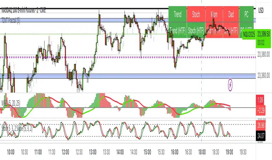
The Visualized Trader (Fractal Timeframe)The **The Visualized Trader (Fractal Timeframe)** indicator for TradingView is a tool designed to help traders identify strong bullish or bearish trends by analyzing multiple technical indicators across two timeframes: the current chart timeframe and a user-selected higher timeframe. It visually displays trend alignment through arrows on the chart and a condition table in the top-right corner, making it easy to see when conditions align for potential trade opportunities.
### Key Features
1. **Multi-Indicator Analysis**: Combines five technical conditions to confirm trend direction:
- **Trend**: Based on the slope of the 50-period Simple Moving Average (SMA). Upward slope indicates bullish, downward indicates bearish.
- **Stochastic (Stoch)**: Uses Stochastic Oscillator (5, 3, 2) to measure momentum. Rising values suggest bullish momentum, falling values suggest bearish.
- **Momentum (Mom)**: Derived from the MACD fast line (5, 20, 30). Rising MACD line indicates bullish momentum, falling indicates bearish.
- **Dad**: Uses the MACD signal line. Rising signal line is bullish, falling is bearish.
- **Price Change (PC)**: Compares the current close to the previous close. Higher close is bullish, lower is bearish.
2. **Dual Timeframe Comparison**:
- Calculates the same five conditions on both the current timeframe and a user-selected higher timeframe (e.g., daily).
- Helps traders see if the trend on the higher timeframe aligns with the current chart, providing context for stronger trade decisions.
3. **Visual Signals**:
- **Arrows on Chart**:
- **Current Timeframe**: Blue upward arrows below bars for bullish alignment, red downward arrows above bars for bearish alignment.
- **Higher Timeframe**: Green upward triangles below bars for bullish alignment, orange downward triangles above bars for bearish alignment.
- Arrows appear only when all five conditions align (all bullish or all bearish), indicating strong trend potential.
4. **Condition Table**:
- Displays a table in the top-right corner with two rows:
- **Top Row**: Current timeframe conditions (Trend, Stoch, Mom, Dad, PC).
- **Bottom Row**: Higher timeframe conditions (labeled with "HTF").
- Each cell is color-coded: green for bullish, red for bearish.
- The table can be toggled on/off via input settings.
5. **User Input**:
- **Show Condition Boxes**: Toggle the table display (default: on).
- **Comparison Timeframe**: Choose the higher timeframe (e.g., "D" for daily, default setting).
### How It Works
- The indicator evaluates the five conditions on both timeframes.
- When all conditions are bullish (or bearish) on a given timeframe, it plots an arrow/triangle to signal a strong trend.
- The condition table provides a quick visual summary, allowing traders to compare the current and higher timeframe trends at a glance.
### Use Case
- **Purpose**: Helps traders confirm strong trend entries by ensuring multiple indicators align across two timeframes.
- **Example**: If you're trading on a 1-hour chart and see blue arrows with all green cells in the current timeframe row, plus green cells in the higher timeframe (e.g., daily) row, it suggests a strong bullish trend supported by both timeframes.
- **Benefit**: Reduces noise by focusing on aligned signals, helping traders avoid weak or conflicting setups.
### Settings
- Access the indicator settings in TradingView to:
- Enable/disable the condition table.
- Select a higher timeframe (e.g., 4H, D, W) for comparison.
### Notes
- Best used in trending markets; may produce fewer signals in choppy conditions.
- Combine with other analysis (e.g., support/resistance) for better decision-making.
- The higher timeframe signals (triangles) provide context, so prioritize trades where both timeframes align.
This indicator simplifies complex trend analysis into clear visual cues, making it ideal for traders seeking confirmation of strong momentum moves.
BoaBias 3RSI(Custom) + Stats3RSI(Custom) + Stats
3RSI(Custom) + Stats is an advanced multi-RSI indicator for professional and active traders. It visualizes overbought/oversold conditions using three independently configured, smoothed RSI lines (defaults: 24, 14, 9), and provides unique statistics on how long your chosen asset stays in these extreme zones.
Key Features
Triple RSI Display: Simultaneously plots three customizable RSI lines, each with its own period and smoothing.
Dynamic Overbought/Oversold Highlights: Background color highlights only when any RSI is above the overbought level or below the oversold level—no clutter, just the key moments.
In-Panel Statistics Table: See current RSI values, and average streak length in overbought and oversold zones for each RSI, calculated over your chosen historical window (default: 360 bars). Table font size can be adjusted in settings for maximum readability.
Configurable Levels: Set your preferred levels for overbought/oversold zones, as well as additional mid-levels for more nuanced analysis.
Alerts: Instantly set up alerts for when any (or each) RSI enters an extreme zone. Never miss a key reversal setup.
How to Use
Use the indicator to objectively spot exhaustion and reversal points on any timeframe and asset.
The average streak statistics help you judge whether the market is behaving “normally” or if an extreme condition is being sustained.
Table with live RSI and stats makes your decision process faster and more data-driven.
Alerts allow you to stay informed even when you’re not watching the chart.
Settings
RSI Periods & Smoothing: Adjust all three lines independently to suit your strategy.
Overbought/Oversold Levels: Customize thresholds to fit your asset or timeframe.
Statistical Window: Define how many bars to use for calculating streak averages.
Font Size: Make the stats table readable on any screen size with adjustable font.
Summary
All-in-one solution for tracking momentum exhaustion with real statistical support.
Visual clarity: only shows what matters, when it matters.
Fully compatible with TradingView alerts for ultimate automation and risk management.
Questions or suggestions? Leave feedback in the comments!

% / ATR Buy, Target, Stop + Overlay & P/L% / ATR Buy, Target, Stop + Overlay & P/L
This tool combines volatility‑based and fixed‑percentage trade planning into a single, on‑chart overlay—with built‑in profit‑and‑loss estimates. Toggle between ATR or percentage modes, plot your Buy, Target and Stop levels, and see the dollar gain or loss for a specified position size—all in one interactive table and chart display.
NOTE: To activate plotted lines, price labels, P/L rows and table values, enter a Buy Price greater than zero.
What It Does
Mode Toggle: Choose between “ATR” (volatility‑based) or “%” (fixed‑percentage) calculations.
Buy Price Input: Manually enter your entry price.
ATR Mode:
Target = Buy + (ATR × Target Multiplier)
Stop = Buy − (ATR × Stop Multiplier)
Percentage Mode:
Target = Buy × (1 + Target % / 100)
Stop = Buy × (1 – Stop % / 100)
P/L Estimates: Specify a dollar amount to “invest” at your Buy price, and the script calculates:
Gain ($): Profit if Target is hit
Loss ($): Cost if Stop is hit
Visual Overlay: Draws horizontal lines for Buy, Target and Stop, with optional price labels on the chart scale.
Interactive Table: Displays Buy, Target, Stop, ATR/timeframe info (in ATR mode), percentages (in % mode), and P/L rows.
Customization Options
Line Settings:
Choose color, style (solid/dashed/dotted), and width for Buy, Target, Stop lines.
Extend lines rightward only or in both directions.
Table Settings:
Position the table (top/bottom × left/right).
Toggle individual rows: Buy Price; Target (multiplier or %); Stop (multiplier or %); Target ATR %; Stop ATR %; ATR Time Frame; ATR Value; Gain ($); Loss ($).
Customize text colors for each row and background transparency.
General Inputs:
ATR length and optional ATR timeframe override (e.g. use daily ATR on an intraday chart).
Target/Stop multipliers or percentages.
Dollar Amount for P/L calculations.
How to Use It for Trading
Plan Your Entry: Enter your intended Buy Price and position size (dollar amount).
Select Mode: Toggle between ATR or % mode depending on whether you prefer volatility‑based or fixed offsets.
Assess R:R and P/L: Instantly see your Target, Stop levels, and potential profit or loss in dollars.
Visual Reference: Lines and price labels update in real time as you tweak inputs—ideal for live trading, backtesting or trade journaling.
Ideal For
Traders who want both volatility‑based and percentage‑based exit options in one tool
Those who need on‑chart P/L estimates based on position size
Swing and intraday traders focused on objective, rule‑based trade management
Anyone who uses ATR for adaptive stops/targets or fixed percentages for simpler exits
PowerBar (Purple Dot) – Price & Volume Spike📌 Overview
This indicator is inspired by the well-known “Purple Dot” indicator popularized by Manas Arora, designed to help traders identify fast-moving stocks exhibiting strong price and volume momentum.
This indicator flags high-activity bars called "PowerBars" — bars where:
Rate of Change (ROC) is equal to or above a user-defined threshold (default 5%)
Volume is equal to or a user-defined threshold (default 500,000)
These bars are visually marked with purple dots and can serve as a signal of strength, interest, or volatility spike.
🔍 How It Works
The indicator:
Calculates bar-level conditions based on:
ROC >= Threshold (e.g., 5%)
Volume >= Threshold (e.g., 500,000)
Flags qualifying bars with a purple dot below the candle
Aggregates PowerBar count over selectable historical periods (1 week, 1M, 3M, 6M, 9M, 12M)
Displays total PowerBars and total return (%) over the selected time period in a clean visual table
🛠 Features
Purple Dot Plotting: Marks bars where price changes rapidly (based on a user-defined Rate of Change threshold) and where volume exceeds a set minimum, signaling potential momentum bursts.
Flexible Timeframes: Count PowerBars and calculate stock return over selectable lookback periods ranging from 1 week to 12 months, adaptable to various trading styles and markets.
PowerBar Count: Tracks and displays the number of PowerBars within the chosen period, helping quantify momentum frequency.
Return Calculation: Shows the percentage return over the selected time horizon, supporting performance validation.
Customizable Summary Table: On-chart table with dark/light themes, adjustable size, and position offers a clean overview of key metrics.
Dual Modes:
Chart Mode: Ideal for single-stock analysis with visual dot markers and performance stats.
PineScreener Mode: Outputs data suitable for PineScreener scanning.
⚙️ Parameters
ROC Threshold (%): Minimum bar-to-bar price change in percentage to signal a PowerBar (default 5%).
Volume Threshold: Minimum volume for a bar to qualify (default 500,000).
PowerBar and Return Periods: Choose from 1 week up to 12 months.
Visual Customization: Enable/disable purple dots, configure the summary table’s appearance, and select dark or light theme.
Mode Selection: Switch easily between Chart Mode and PineScreener Mode based on use case.
📬 Alerts
Set alerts for PowerBars (purple dots) to get notified when a strong price-volume bar appears.

OBR 15min Session Opening Range Breakout + Volume Trend DeltaQuick Overview
This Pine Script plots the opening range for London and New York sessions, highlights breakout levels, draws previous session pivots, and offers a live volume delta table for trend confirmation.
Session Opening Range
- Captures the high/low of the first 15 minutes (configurable) for both London & NY sessions.
- Fills the range area with adjustable semi‑transparent colors.
- Optional alerts fire on breakout above the high or below the low.
Previous Session Levels
- Automatically draws previous day’s High, Low, Open and previous 4‑hour High/Low.
- Helps identify key S/R zones as price approaches ORB breakouts.
Volume Trend Delta
- Uses a CMO‑weighted moving average and ATR bands to detect trend state.
- Accumulates bullish vs. bearish volume during each trend.
- Displays Bull Vol, Bear Vol, and Delta % in a movable table for quick strength checks.
How to Use
1. Let the opening range complete (first 15 min).
2. Look for price closing above/below the ORB—enter long on an upside break, short on a downside break.
3. Check the Volume Delta table: positive delta confirms buying strength; negative delta confirms selling pressure.
4. Use previous day/4h levels as additional support/resistance filters.
Settings & Customization
- ORB Duration & Session Times (London/NY), fill colors, and toggles.
- Enable/disable Previous Day & 4H levels.
- Trend Period, Momentum Window, and Delta table position/size.
- Pre‑built alert conditions for all ORB breakouts.
Developer Notes
- Fully commented for easy adjustments.
- Modular sections: ORB, previous levels, trend delta, and alerts.
- No external libraries—pure Pine Script v6.
Tip
Combine ORB breakouts with Volume Delta and prior session pivots to filter false signals and trade stronger, more reliable moves.
order flow buy/sell and profundity OrderBook Buy/Sell Flow & Polarity Indicator
This powerful indicator provides a detailed look into the market's internal dynamics by visualizing Order Flow (Tape/Time & Sales) and Price Polarity directly on your chart, all within a clean, customizable table. Understand real-time buying and selling pressure and gain insights into who's in control of the candle.
Key Features:
Real-time Order Flow (Tape/Time & Sales): Tracks individual "ticks" (price and volume updates) within the current bar, allowing you to see the immediate impact of buy and sell orders.
Dynamic Table Display: All data is presented in an intuitive, customizable table that can be positioned anywhere on your chart.
Aggregated Buy/Sell Volume: Clearly distinguishes between volume driven by buying (price moving up on a tick) and selling (price moving down on a tick).
"Rocket" Order Detection: Highlights unusually large buy or sell orders based on configurable thresholds (in BTC Millions for major cryptos, and Thousands/Millions for others), helping you spot significant institutional or whale activity.
Candle Polarity Section: A dedicated area in the table that shows the percentage of buying vs. selling volume for the entire current candle. The central cell dynamically blends between bullish (green) and bearish (red) colors, visually representing the dominant polarity.
Customizable Aesthetics: Full control over table colors, text colors, font sizes, and individual label colors to match your chart's theme.
Lightweight & Efficient: Designed to run smoothly without significant impact on your chart's performance.
Why Use This Indicator?
Most indicators only show you the result of price action. The "OrderBook Buy/Sell Flow & Polarity" indicator goes deeper, showing you the cause behind the price movement. By understanding the immediate order flow and the underlying buy/sell pressure within each candle, you can:
Identify accumulation or distribution: Spot when smart money might be entering or exiting positions.
Confirm breakouts/breakdowns: See if there's genuine volume behind price moves.
Gauge market sentiment in real-time: Quickly assess who is more aggressive – buyers or sellers.
Improve entry and exit points: Make more informed decisions based on live market activity.
Settings & Customization:
The indicator comes with a comprehensive set of input options, allowing you to fine-tune its appearance and functionality:
Table Position: Choose from various chart locations (Top/Middle/Bottom, Left/Center/Right).
Window Size (Order Flow): Adjust how many recent order flow "ticks" are displayed.
Colors: Personalize all table, text, and label colors.
Rocket Thresholds: Define the volume levels for "rocket" order detection based on asset type.
Polarity Section Toggle: Enable or disable the real-time candle polarity display.
Note: This indicator provides insights based on available real-time tick data from TradingView. While it simulates aspects of order book and tape reading, it is important to remember that direct access to full exchange Level 2 data is not available on TradingView.
Disclaimer: This indicator is for informational purposes only and should not be considered financial advice. Trading involves risk, and past performance is not indicative of future results.

BitDoctor Risk Appetite DashboardBitDoctor Risk Appetite Dashboard
The BitDoctor Risk Appetite Dashboard is a powerful tool for gauging market sentiment and risk appetite across major asset classes. It combines equity, credit, emerging markets, interest rates, and crypto signals into a single dashboard, giving traders a clear view of current market dynamics.
What it does:
- Calculates momentum for each key asset using a 14-day rate of change.
- Normalizes each signal and plots a composite Risk Appetite Strength Index (RASI) on the chart.
- Displays a dashboard table showing the momentum of each component in percentage terms alongside the composite RASI.
How to use it:
The plotted RASI line shows overall risk appetite:
- Positive readings suggest a stronger risk-on environment.
- Negative readings indicate risk-off sentiment.
The dashboard table (top-right corner by default) displays two columns:
- Asset : The tracked asset symbol.
- Momentum : The current 14-day rate of change as a percentage.
Interpreting the table:
Each row represents a component of market risk sentiment:
- SPY : US equities.
- HYG : High yield bonds (credit risk appetite).
- EEM : Emerging markets.
- 1/UST10Y : Inverted 10-year Treasury yield (lower yields support risk appetite).
- ETH : Ethereum (crypto risk proxy).
- RASI : The average of the above signals, indicating overall market risk appetite.
Higher positive values in the table suggest rising momentum in that asset, which contributes positively to the composite RASI. Conversely, negative values signal declining momentum. You can use these individual readings to see which sectors are driving the current risk sentiment and to time entries and exits accordingly.
Customization:
The indicator allows you to adjust the table's background color, text color, text size, cell padding, and position so it remains readable and unobtrusive regardless of your chart theme.
Use the BitDoctor Risk Appetite Dashboard as part of a broader analysis to align your trades with prevailing risk conditions. It is not a standalone trading signal but a context tool to support better decision-making.
Why these assets were chosen:
The dashboard uses a carefully selected mix of widely-followed proxies for global risk sentiment:
- SPY : Represents large-cap US equity market performance, a key barometer of investor confidence.
- HYG : Tracks high-yield corporate bonds, reflecting credit risk appetite in fixed income markets.
- EEM : Captures emerging market equities, which are highly sensitive to global risk-on/off dynamics.
- 1/UST10Y : The inverse of the US 10-year Treasury yield, as falling yields often accompany risk-on moves and vice versa.
- ETH : Ethereum as a representative crypto asset, offering insight into speculative risk appetite in digital assets.
This mix provides a comprehensive view of sentiment across traditional and alternative markets, making the dashboard a robust tool for gauging overall risk appetite.

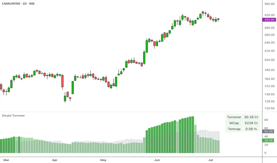
Simple Turnover with TOMCAPOverview
Turnover, or the total value traded over a given period, helps you gauge whether there’s enough liquidity in the instrument being traded. This indicator calculates the average turnover and presents it as a bar-by-bar plot. It also calculates the turnover-to-market capitalization (Tomcap) ratio, and presents this in a configurable table or text summary.
Introduction
Volume indicates the total number of shares that have been bought or sold in a specific period or during the trading day.
A company's market capitalization at any given time can be determined by multiplying its stock price by the number of shares outstanding.
Share turnover is a measure of stock liquidity, calculated by dividing the total number of shares traded during some period by the average number of shares outstanding for the same period. The higher the share turnover, the more liquid company shares are.
Compared to traditional volumes, potting the change in turnover can provide a better representation of the flow of money.
At its simplest, the daily turnover on each bar is computed as the closing price for a stock multiplied by its average volume:
turnover = volume * close / 10000000
The script calculates this by using average prices for both:
turnover = sma_volume * sma_close / 10000000
Script Basics
The script computes & plots the n-period average turnover by multiplying the moving average of price and volume.
By default, the market cap is plotted bar by bar as a background behind the turnover bars.
Every time the turnover reaches a new high in a quarter, the color of the turnover bars turns dark green. This represents the HTQ (Highest Turnover in a Quarter) , and multiple consecutive HTQs indicate a significant influx of funds into that stock.
Uses
The primary purpose of the script is to assist traders in making more informed decisions regarding stock selection.
1. Screen out non-tradable stocks
Quickly spot low-turnover names (illiquid stocks) to avoid wide spreads. Filter out any stocks whose average daily turnover is below, say, ₹5 Cr. This helps in eliminating tickers whose average turnover never clears your minimum threshold.
Example of a high-turnover stock:
Example of a low-turnover stock:
2. Turnover expansion
Observe when the average turnover suddenly expands from its previously subdued values. This occurs when money begins to flow in due to a catalyst, sectoral push, news flow, or any institutional activity.
Example:
3. Relative liquidity comparison
Even average turnover can sometimes overlook the context if we don’t know the company's size. That’s why the script also measures:
Turnover vs. Market cap (TOMCAP) , answering “What percent of the company’s value trades each day?”
Turnover vs. Free Float (TOFF) , showing liquidity against shares actually available for trading.
For example:
A small-cap stock with ₹1 Cr turnover but only ₹50 Cr market cap (Tomcap = 2 %)
vs. a large-cap with ₹10 Cr turnover and ₹20,000 Cr cap (Tomcap = 0.05 %)
Customization
A. Appearance
Dark Mode toggle switches colors to match your dark layout
Show turnover in Crores or Millions
B. What to show
Select the table size and position (e.g., top-left, bottom-center)
Under Table Settings, enable or disable any row:
Turnover
Mcap (market capitalization)
FF (free float)
1-Min liquidity (average turnover on 1-min bars)
Tomcap (Turnover to market capitalization) or Toff (Turnover to Free Float) ratio
C. Display mode
Table: a multi-row grid with colored cells
Text: a single summary string
Non-Commercial Bias TrackerNon-Commercial Bias Tracker
Overview
The Non-Commercial Bias Tracker is a sophisticated sentiment analysis tool designed to provide traders with a clear view of the positioning of institutional speculators in the futures market. By analyzing the weekly Commitment of Traders (COT) report, this indicator helps you understand the underlying bias of large market participants for a wide range of assets, including forex, commodities, and indices.
The primary goal of this tool is to identify the prevailing trend in market sentiment and alert you to significant shifts in that trend, allowing you to align your strategy with the flow of institutional money.
Key Features
Dual Asset Analysis: Automatically detects the two assets in a trading pair (e.g., EUR and USD in EURUSD) or a single asset (e.g., GOLD) and displays their sentiment data side-by-side.
Comprehensive Data Table: A clean, customizable dashboard shows you the most critical sentiment metrics at a glance, including the current Net Position, the Change %, and the Overall Bias.
Visual Sentiment Plot: The indicator plots the primary sentiment metric and its signal line, giving you a visual representation of momentum and trend.
Clear Bias-Shift Signals: Green and red circles appear directly on the plot to highlight the exact moment the underlying sentiment momentum shifts, providing clear and timely signals.
How to Use the Indicator
Important Note: The Commitment of Traders data is released weekly. For the most accurate and meaningful signals, it is strongly recommended to use this indicator on the Weekly (W) chart timeframe.
1. The Data Table
The table in the corner of your screen is your main dashboard. Here’s what each row means:
Net Position: Shows the net difference between long (bullish) and short (bearish) contracts held by non-commercial traders. A positive number indicates a net long position; a negative number indicates a net short position.
Change %: This is the primary metric used for analysis, representing the net sentiment as a percentage.
Overall Bias: This is the final output of the indicator's analysis. It provides a clear "Long" or "Short" signal based on the current sentiment momentum. This cell is color-coded for quick interpretation (Green for Long, Red for Short).
2. The Chart Plots
Blue Line: Represents the current sentiment metric ("Change %" or "Net Position %").
Orange Line: Represents the signal line, or the average sentiment over a specific period.
Crossover Signals:
A Green Circle appears when the blue line crosses above the orange line, signaling a shift to a Long Bias.
A Red Circle appears when the blue line crosses below the orange line, signaling a shift to a Short Bias.
Settings & Customization
You can tailor the indicator to your specific needs via the Settings menu:
Data Source: Choose between "Futures Only" or the combined "Futures and Options" data.
Metric Type: Select whether to analyze the market using "Change %" (for momentum) or "Net Position %" (for conviction).
Bias Signal Line Length: Adjust the sensitivity of the crossover signals. A shorter length is faster, while a longer length provides smoother, more confirmed signals.
Style Settings: Customize the position of the data table and the color of the text to match your chart theme.
Disclaimer: This indicator is a tool for analysis and should not be considered as direct financial advice. All trading involves risk. Always use proper risk management and conduct your own due diligence before making any trading decisions.

Smart LevelsSmart Levels - Professional Support & Resistance Indicator
🔥 ADVANCED TRUE OPENS & HIGH/LOW DETECTION SYSTEM
Smart Levels is a comprehensive technical analysis tool designed for professional traders who demand precision in identifying key market levels across multiple timeframes. This indicator automatically detects and displays critical support and resistance levels based on institutional trading concepts.
🎯 KEY FEATURES
TRUE OPENS DETECTION
Annual True Open: April 1st market opening (Q2 institutional cycle start)
Monthly Q1 & Q2 True Opens: First and second Monday of each month (customizable hours: 18:00 NY or 00:00 NY)
Weekly True Open: Every Monday at 18:00 NY (institutional week start)
Daily True Open: Midnight NY time (00:00 NY)
HIGH/LOW LEVELS IDENTIFICATION
Daily Highs & Lows: Previous day's extreme levels
Weekly Highs & Lows: Previous week's extreme levels
Monthly Highs & Lows: Previous month's extreme levels
Quarterly Highs & Lows: Previous quarter's extreme levels
Annual Highs & Lows: Previous year's extreme levels
ADVANCED CUSTOMIZATION
Master Controls: Enable/disable entire groups with one click
⚙️ Auto Scale Adjustment: Keep chart focused on price action (lines don't compress the view)
Individual Control: Each level can be configured independently
Line Styles: Solid, dashed, or dotted lines
Extension Types: Fixed displacement or last candle alignment
Color Coding: Fully customizable colors for each timeframe
PROFESSIONAL DISPLAY
Information Table: Live quarterly cycle status with color coding
Smart Labels: Price levels clearly marked with descriptive text
Multiple Positioning: Table can be positioned anywhere on chart
Clean Interface: Professional appearance with customizable text sizes
📊 INSTITUTIONAL CONCEPTS
This indicator is built on institutional trading principles:
Q1 (Accumulation): Smart money accumulation phase
Q2 (Manipulation): Price manipulation and liquidity hunting
Q3 (Distribution): Smart money distribution phase
Q4 (Continuation/Reversal): Trend continuation or major reversal
⚡ MASTER CONTROLS
🔥 DISPLAY ALL TRUE OPENS
Toggle all True Open levels on/off with a single click
📊 DISPLAY ALL HIGHS & LOWS
Toggle all High/Low levels on/off with a single click
⚙️ AUTO SCALE ADJUSTMENT (NEW FEATURE)
ON: Lines extend but don't affect chart scaling (maintains focus on price action)
OFF: Traditional behavior (lines may compress chart view)
Default: ENABLED for optimal trading experience
🛠 CONFIGURATION OPTIONS
True Open Settings (Per Timeframe)
Enable/Disable individual True Opens
Hour selection for monthly levels (18:00 NY or 00:00 NY)
Extension type: Fixed displacement or last candle alignment
Line appearance: Color, style, and width
Maximum number of lines displayed
High/Low Settings (Per Timeframe)
Enable/Disable individual High/Low pairs
Extension configuration
Separate colors for highs and lows
Line styling options
Information Table
Show/Hide information panel
Detailed view toggle
Position selection (6 options)
Text and background color customization
Text size adjustment
🎨 VISUAL FEATURES
Color-Coded Quarters: Each quarterly phase has distinct colors
Smart Positioning: Lines extend 20 candles beyond current price for clarity
Professional Labels: Clean price level identification
Memory Efficient: Automatic cleanup of old levels
Multi-Timeframe: Works on all timeframes from 1-minute to monthly
💡 TRADING APPLICATIONS
Support & Resistance
Previous High/Low levels act as natural S&R zones
True Opens often become significant pivot points
Institutional Analysis
Track quarterly cycles for macro trend analysis
Identify accumulation and distribution phases
Entry & Exit Points
Use level breaks for entry signals
Set targets at next timeframe levels
Risk Management
Place stops beyond key institutional levels
Size positions based on level confluence
🔧 TECHNICAL SPECIFICATIONS
Pine Script Version: v6
Overlay: Yes (displays directly on price chart)
Max Objects: 500 lines, 500 labels, 500 boxes
Timezone: America/New_York (institutional standard)
Performance: Optimized for all chart timeframes
Compatibility: Works with all TradingView accounts
📈 RECOMMENDED USAGE
Enable Master Controls for full functionality
Keep Auto Scale ON for optimal chart viewing
Customize colors to match your trading style
Use Information Table to track current quarterly phase
Combine with price action for high-probability setups
Smart Levels transforms complex institutional concepts into clear, actionable visual information. Whether you're scalping intraday moves or analyzing long-term trends, this indicator provides the precision levels professional traders depend on.
📊 Trade with institutional precision. Trade with Smart Levels.Tentar novamenteO Claude pode cometer erros. Confira sempre as respostas.Pesquisa Sonnet 4

ATR Buy, Target, Stop + OverlayATR Buy, Target, Stop + Overlay
This tool is to assist traders with precise trade planning using the Average True Range (ATR) as a volatility-based reference.
This script plots buy, target, and stop-loss levels on the chart based on a user-defined buy price and ATR-based multipliers, allowing for objective and adaptive trade management.
*NOTE* In order for the indicator to initiate plotted lines and table values a non-zero number must be entered into the settings.
What It Does:
Buy Price Input: Users enter a manual buy price (e.g., an executed or planned trade entry).
ATR-Based Target and Stop: The script calculates:
Target Price = Buy + (ATR × Target Multiplier)
Stop Price = Buy − (ATR × Stop Multiplier)
Customizable Timeframe: Optionally override the ATR timeframe (e.g., use daily ATR on a 1-hour chart).
Visual Overlay: Lines are drawn directly on the price chart for the Buy, Target, and Stop levels.
Interactive Table: A table is displayed with relevant levels and ATR info.
Customization Options:
Line Settings:
Adjust color, style (solid/dashed/dotted), and width for Buy, Target, and Stop lines.
Choose whether to extend lines rightward only or in both directions.
Table Settings:
Choose position (top/bottom, left/right).
Toggle individual rows for Buy, Target, Stop, ATR Timeframe, and ATR Value.
Customize text color and background transparency.
How to Use It for Trading:
Plan Your Trade: Enter your intended buy price when planning a trade.
Assess Risk/Reward: The script immediately visualizes the potential stop-loss and target level, helping assess R:R ratios.
Adapt to Volatility: Use ATR-based levels to scale stop and target dynamically depending on current market volatility.
Higher Timeframe ATR: Select a different timeframe for the ATR calculation to smooth noise on lower timeframe charts.
On-the-Chart Reference: Visually track trade zones directly on the price chart—ideal for live trading or strategy backtesting.
Ideal For:
Swing traders and intraday traders
Risk management and trade planning
Traders using ATR-based exits or scaling
Visualizing asymmetric risk/reward setups
How I Use This:
After entering a trade, adding an entry price will plot desired ATR target and stop level for visualization.
Adjusting ATR multiplier values assists in evaluating and planning trades.
Visualization assists in comparing ATR multiples to recent support and resistance levels.

Rolling VWAP LevelsRolling VWAP Levels Indicator
Overview
Dynamic horizontal lines showing rolling Volume Weighted Average Price (VWAP) levels for multiple timeframes (7D, 30D, 90D, 365D) that update in real-time as new bars form.
Who This Is For
Day traders using VWAP as support/resistance
Swing traders analyzing multi-timeframe price structure
Scalpers looking for mean reversion entries
Options traders needing volatility bands for strike selection
Institutional traders tracking volume-weighted fair value
Risk managers requiring dynamic stop levels
How To Trade With It
Mean Reversion Strategies:
Buy when price is below VWAP and showing bullish divergence
Sell when price is above VWAP and showing bearish signals
Use multiple timeframes - enter on shorter, confirm on longer
Target opposite VWAP level for profit taking
Breakout Trading:
Watch for price breaking above/below key VWAP levels with volume
Use 7D VWAP for intraday breakouts
Use 30D/90D VWAP for swing trade breakouts
Confirm breakout with move beyond first standard deviation band
Support/Resistance Trading:
VWAP levels act as dynamic support in uptrends
VWAP levels act as dynamic resistance in downtrends
Multiple timeframe VWAP confluence creates stronger levels
Use standard deviation bands as additional S/R zones
Risk Management:
Place stops beyond next VWAP level
Use standard deviation bands for position sizing
Exit partial positions at VWAP levels
Monitor distance table for overextended moves
Key Features
Real-time Updates: Lines move and extend as new bars form
Individual Styling: Custom colors, widths, styles for each timeframe
Standard Deviation Bands: Optional volatility bands with custom multipliers
Smart Labels: Positioned above, below, or diagonally relative to lines
Distance Table: Shows percentage distance from each VWAP level
Alert System: Get notified when price crosses VWAP levels
Memory Efficient: Automatically cleans up old drawing objects
Settings Explained
Display Group: Show/hide labels, font size, line transparency, positioning
Individual VWAP Groups: Color, line width (1-5), line style for each timeframe
Standard Deviation Bands: Enable bands with custom multipliers (0.5, 1.0, 1.5, 2.0, etc.)
Labels Group: Position (8 options including diagonal), custom text, price display
Additional Info: Distance table, alert conditions
Technical Implementation
Uses rolling arrays to maintain sliding windows of price*volume data. The core calculation function processes both VWAP and standard deviation efficiently. Lines are created dynamically and updated every bar. Memory management prevents object accumulation through automatic cleanup.
Best Practices
Start with 7D and 30D VWAP for most strategies
Add 90D/365D for longer-term context
Use standard deviation bands when volatility matters
Position labels to avoid chart clutter
Enable distance table during high volatility periods
Set alerts for key VWAP level breaks
Market Applications
Forex: Major pairs during London/NY sessions
Stocks: Large cap names with good volume
Crypto: Bitcoin, Ethereum, major altcoins
Futures: ES, NQ, CL, GC with continuous volume
Options: Use SD bands for strike selection and volatility assessment

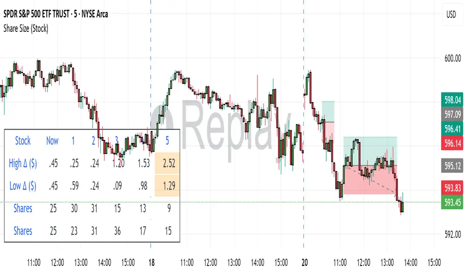
Share SizePurpose: The "Share Size" indicator is a powerful risk management tool designed to help traders quickly determine appropriate share/contract sizes based on their predefined risk per trade and the current market's volatility (measured by ATR). It calculates potential dollar differences from recent highs/lows and translates them into a recommended share/contract size, accounting for a user-defined ATR-based offset. This helps you maintain consistent risk exposure across different instruments and market conditions.
How It Works: At its core, the indicator aims to answer the question: "How many shares/contracts can I trade to keep my dollar risk within limits if my stop loss is placed at a recent high or low, plus an ATR-based buffer?"
Price Difference Calculation: It first calculates the dollar difference between the current close price and the high and low of the current bar (Now) and the previous 5 bars (1 to 5).
Tick Size & Value Conversion: These price differences are then converted into dollar values using the instrument's specific tickSize and tickValue. You can select common futures contracts (MNQ, MES, MGC, MCL), a generic "Stock" setting, or define custom values.
ATR Offset: An Average True Range (ATR) based offset is added to these dollar differences. This offset acts as a buffer, simulating a stop loss placed beyond the immediate high/low, accounting for market noise or volatility.
Risk-Based Share Size: Finally, using your Default Risk ($) input, the indicator calculates how many shares/contracts you can take for each of the 6 high/low scenarios (current bar, 5 previous bars) to ensure your dollar risk per trade remains constant.
Dynamic Table: All these calculations are presented in a clear, real-time table at the bottom-left of your chart. The table dynamically adjusts its "Label" to show the selected symbol preset, making it easy to see which instrument's settings are currently being used. The "Shares" rows indicate the maximum shares/contracts you can trade for a given risk and stop placement. The cells corresponding to the largest dollar difference (and thus smallest share size) for both high and low scenarios are highlighted, drawing your attention to the most conservative entry points.
Key Benefits:
Consistent Risk: Helps maintain a consistent dollar risk per trade, regardless of the instrument or its current price/volatility.
Dynamic Sizing: Automatically adjusts share/contract size based on market volatility and your chosen stop placement.
Quick Reference: Provides a real-time, easy-to-read table directly on your chart, eliminating manual calculations.
Informed Decision Making: Assists in quickly assessing trade opportunities and potential position sizes.
Setup Parameters (Inputs)
When you add the "Share Size" indicator to your chart, you'll see a settings dialog with the following parameters:
1. Symbol Preset:
Purpose: This is the primary setting to define the tick size and value for your chosen trading instrument.
Options:
MNQ (Micro Nasdaq 100 Futures)
MES (Micro E-mini S&P 500 Futures)
MGC (Micro Gold Futures)
MCL (Micro Crude Oil Futures)
Stock (Generic stock setting, with tick size/value of 0.01)
Custom (Allows you to manually input tick size and value)
Default: MNQ
Importance: Crucial for accurate dollar calculations. Ensure this matches the instrument you are trading.
2. Tick Size (Manual Override):
Purpose: Only used if Symbol Preset is set to Custom. This defines the smallest price increment for your instrument.
Type: Float
Default: 0.25
Hidden: This input is hidden (display=display.none) unless "Custom" is selected. You might need to change display=display.none to display=display.inline in the code if you want to see and adjust it directly in the settings for "Custom" mode.
3. Tick Value (Manual Override):
Purpose: Only used if Symbol Preset is set to Custom. This defines the dollar value of one tickSize increment.
Type: Float
Default: 0.50
Hidden: This input is hidden (display=display.none) unless "Custom" is selected. Similar to Tick Size, you might need to adjust its display property if you want it visible.
4. Default Risk ($):
Purpose: This is your maximum desired dollar risk per trade. All share size calculations will be based on this value.
Type: Float
Default: 50.0
Hidden: This input is hidden (display=display.none). It's a critical setting, so consider making it visible by changing display=display.none to display=display.inline in the code if you want users to easily adjust their risk.
ATR Offset Settings (Group): This group of settings allows you to fine-tune the ATR-based buffer added to your potential stop loss.
5. ATR Offset Length:
Purpose: Defines the lookback period for the Average True Range (ATR) calculation used for the offset.
Type: Integer
Default: 7
Hidden: This input is hidden (display=display.none).
6. ATR Offset Timeframe:
Purpose: Specifies the timeframe on which the ATR for the offset will be calculated. This allows you to use ATR from a higher timeframe for your stop buffer, even if your chart is on a lower timeframe.
Type: Timeframe string (e.g., "1" for 1 minute, "60" for 1 hour, "D" for Daily)
Default: "1" (1 Minute)
Hidden: This input is hidden (display=display.none).
7. ATR Offset Multiplier (x ATR):
Purpose: Multiplies the calculated ATR value to determine the final dollar offset added to your high/low price difference. A value of 1.0 means one full ATR is added. A value of 0.5 means half an ATR is added.
Type: Float
Minimum Value: 0 (no offset)
Default: 1.0
Hidden: This input is hidden (display=display.none).
Line Strategy v6Line Indicator for TradingView
This Pine Script indicator identifies the largest candles on both 5-minute and 1-hour timeframes within the last 240 five-minute bars. It provides visual markers and detailed information to help traders spot significant price movements.
Key Features
Dual Timeframe Analysis:
Identifies largest candle on 5-minute timeframe
Identifies largest candle on 1-hour timeframe (aggregated from 12 five-minute candles)
Visual Markers:
Blue label marks the highest-range 5-minute candle
Purple background highlights the highest-range hourly candle period
Information Table:
Shows price ranges for both timeframes
Displays precise timestamps for identified candles
Color-coded for quick reference
Progress Indicator:
Shows how many bars have been collected (out of 240 required)
How It Works
Data Collection:
Stores high, low, timestamp, and bar index of the last 240 five-minute candles
Automatically updates with each new bar
5-Minute Analysis:
Scans all 5-minute candles to find the one with the largest price range (high - low)
Marks this candle with a blue label showing its range
Hourly Analysis:
Groups 12 five-minute candles to form each hourly candle
Finds the hourly candle with the largest price range
Highlights the entire hour period with a purple background
Information Display:
Creates a table in the top-right corner showing:
Range values for both timeframes
Timestamps of identified candles
Time period of the largest hourly candle
Usage Instructions
Apply the indicator to any 5-minute chart
Wait for the indicator to collect 240 bars (about 20 trading hours)
Results will appear automatically:
Blue label on the largest 5-minute candle
Purple background on the largest hourly candle period
Information table with detailed metrics
Customization Options
You can easily adjust these aspects by modifying the code:
Colors of markers and table cells
Transparency levels of background highlights
Precision of range values displayed
Position of the information table
The indicator is optimized for performance and works in both historical and real-time modes.
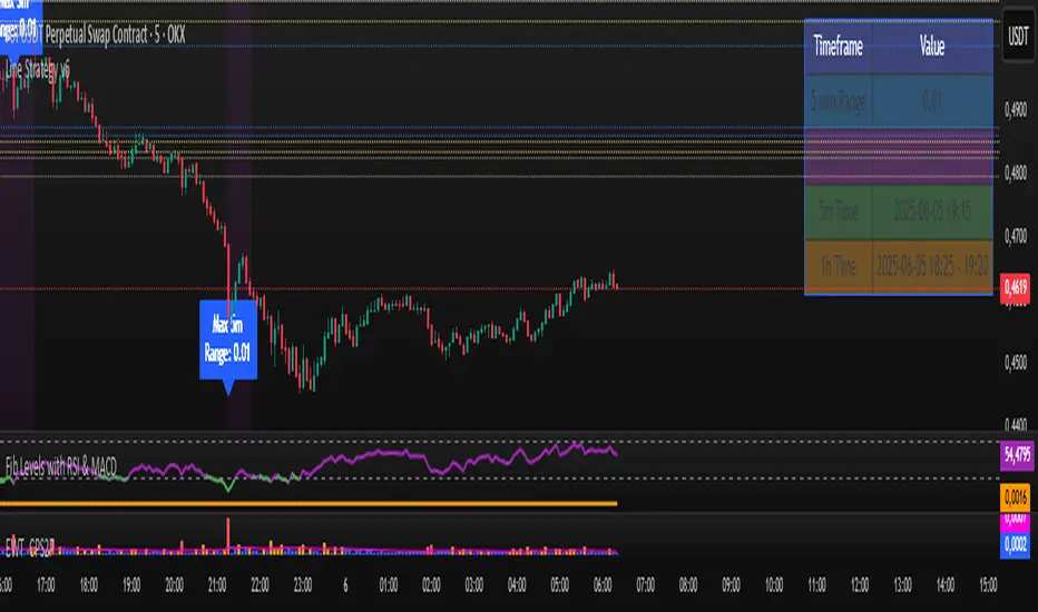
Options Volatility Strategy Analyzer [TradeDots]The Options Volatility Strategy Analyzer is a specialized tool designed to help traders assess market conditions through a detailed examination of historical volatility, market benchmarks, and percentile-based thresholds. By integrating multiple volatility metrics (including VIX and VIX9D) with color-coded regime detection, the script provides users with clear, actionable insights for selecting appropriate options strategies.
📝 HOW IT WORKS
1. Historical Volatility & Percentile Calculations
Annualized Historical Volatility (HV): The script automatically computes the asset’s historical volatility using log returns over a user-defined period. It then annualizes these values based on the chart’s timeframe, helping you understand the asset’s typical volatility profile.
Dynamic Percentile Ranks: To gauge where the current volatility level stands relative to past behavior, historical volatility values are compared against short, medium, and long lookback periods. Tracking these percentile ranks allows you to quickly see if volatility is high or low compared to historical norms.
2. Multi-Market Benchmark Comparison
VIX and VIX9D Integration: The script tracks market volatility through the VIX and VIX9D indices, comparing them to the asset’s historical volatility. This reveals whether the asset’s volatility is outpacing, lagging, or remaining in sync with broader market volatility conditions.
Market Context Analysis: A built-in term-structure check can detect market stress or relative calm by measuring how VIX compares to shorter-dated volatility (VIX9D). This helps you decide if the present environment is risk-prone or relatively stable.
3. Volatility Regime Detection
Color-Coded Background: The analyzer assigns a volatility regime (e.g., “High Asset Vol,” “Low Asset Vol,” “Outpacing Market,” etc.) based on current historical volatility percentile levels and asset vs. market ratios. A color-coded background highlights the regime, enabling traders to quickly interpret the market’s mood.
Alerts on Regime Changes & Spikes: Automated alerts warn you about any significant expansions or contractions in volatility, allowing you to react swiftly in changing conditions.
4. Strategy Forecast Table
Real-Time Strategy Suggestions: At the close of each bar, an on-chart table generates suggested options strategies (e.g., selling premium in high volatility or buying premium in low volatility). These suggestions provide a quick summary of potential tactics suited to the current regime.
Contextual Market Data: The table also displays key statistics, such as VIX levels, asset historical volatility percentile, or ratio comparisons, helping you confirm whether volatility conditions warrant more conservative or more aggressive strategies.
🛠️ HOW TO USE
1. Select Your Timeframe: The script supports multiple timeframes. For short-term trading, intraday charts often reveal faster shifts in volatility. For swing or position trading, daily or weekly charts may be more stable and produce fewer false signals.
2. Check the Volatility Regime: Observe the background color and on-chart labels to identify the current regime (e.g., “HIGH ASSET VOL,” “LOW VOL + LAGGING,” etc.).
3. Review the Forecast Table: The table suggests strategy ideas (e.g., iron condors, long straddles, ratio spreads) depending on whether volatility is elevated, subdued, or spiking. Use these as a starting point for designing trades that match your risk tolerance.
4. Combine with Additional Analysis: For optimal results, confirm signals with your broader trading plan, technical tools (moving averages, price action), and fundamental research. This script is most effective when viewed as one component in a comprehensive decision-making process.
❗️LIMITATIONS
Directional Neutrality: This indicator analyzes volatility environments but does not predict price direction (up/down). Traders must combine with directional analysis for complete strategy selection.
Late or Missed Signals: Since all calculations require a bar to close, sharp intrabar volatility moves may not appear in real-time.
False Positives in Choppy Markets: Rapid changes in percentile ranks or VIX movements can generate conflicting or premature regime shifts.
Data Sensitivity: Accuracy depends on the availability and stability of volatility data. Significant gaps or unusual market conditions may skew results.
Market Correlation Assumptions: The system assumes assets generally correlate with S&P 500 volatility patterns. May be less effective for:
Small-cap stocks with unique volatility drivers
International stocks with different market dynamics
Sector-specific events disconnected from broad market
Cryptocurrency-related assets with independent volatility patterns
RISK DISCLAIMER
Options trading involves substantial risk and is not suitable for all investors. Options strategies can result in significant losses, including the total loss of premium paid. The complexity of options strategies requires thorough understanding of the risks involved.
This indicator provides volatility analysis for educational and informational purposes only and should not be considered as investment advice. Past volatility patterns do not guarantee future performance. Market conditions can change rapidly, and volatility regimes may shift without warning.
No trading system can guarantee profits, and all trading involves the risk of loss. The indicator's regime classifications and strategy suggestions should be used as part of a comprehensive trading plan that includes proper risk management, directional analysis, and consideration of broader market conditions.
RSI Multi-TF TabRSI Multi-Timeframe Table 📊
A tool for multi-timeframe RSI analysis with visual overbought/oversold level highlighting.
Description
This indicator calculates the Relative Strength Index (RSI) for the current chart and displays RSI values across five additional timeframes (15m, 1h, 4h, 1d, 1w) in a dynamic table. The color-coded system simplifies identifying overbought (>70), oversold (<30), and neutral zones. Visual signals on the chart enhance analysis for the current timeframe.
Key Features
✅ Multi-Timeframe Analysis :
Track RSI across 15m, 1h, 4h, 1d, and 1w in a compact table.
Color-coded alerts:
🔴 Red — Overbought (potential pullback),
🔵 Blue — Oversold (potential rebound),
🟡 Yellow — Neutral zone.
✅ Visual Signals :
Background shading for oversold/overbought zones on the main chart.
Horizontal lines at 30 and 70 levels for reference.
✅ Customizable Settings :
Adjust RSI length (default: 14), source (close, open, high, etc.), and threshold levels.
How to Use
Table Analysis :
Compare RSI values across timeframes to spot divergences (e.g., overbought on 15m vs. oversold on D).
Use colors for quick decisions.
Chart Signals :
Blue background suggests bullish potential (oversold), red hints at bearish pressure (overbought).
Always confirm with other tools (volume, trends, or candlestick patterns).
Examples :
RSI(1h) > 70 while RSI(4h) < 30 → Possible reversal upward.
Sustained RSI(1d) above 50 may indicate a bullish trend.
Settings
RSI Length : Period for RSI calculation (default: 14).
RSI Source : Data source (close, open, high, low, hl2, hlc3, ohlc4).
Overbought/Oversold Levels : Thresholds for alerts (default: 70/30).
Important Notes
No direct trading signals : Use this as an analytical tool, not a standalone strategy.
Test strategies historically and consider market context before trading.

MVRV Ratio [Alpha Extract]The MVRV Ratio Indicator provides valuable insights into Bitcoin market cycles by tracking the relationship between market value and realized value. This powerful on-chain metric helps traders identify potential market tops and bottoms, offering clear buy and sell signals based on historical patterns of Bitcoin valuation.
🔶 CALCULATION The indicator processes MVRV ratio data through several analytical methods:
Raw MVRV Data: Collects MVRV data directly from INTOTHEBLOCK for Bitcoin
Optional Smoothing: Applies simple moving average (SMA) to reduce noise
Status Classification: Categorizes market conditions into four distinct states
Signal Generation: Produces trading signals based on MVRV thresholds
Price Estimation: Calculates estimated realized price (Current price / MVRV ratio)
Historical Context: Compares current values to historical extremes
Formula:
MVRV Ratio = Market Value / Realized Value
Smoothed MVRV = SMA(MVRV Ratio, Smoothing Length)
Estimated Realized Price = Current Price / MVRV Ratio
Distance to Top = ((3.5 / MVRV Ratio) - 1) * 100
Distance to Bottom = ((MVRV Ratio / 0.8) - 1) * 100
🔶 DETAILS Visual Features:
MVRV Plot: Color-coded line showing current MVRV value (red for overvalued, orange for moderately overvalued, blue for fair value, teal for undervalued)
Reference Levels: Horizontal lines indicating key MVRV thresholds (3.5, 2.5, 1.0, 0.8)
Zone Highlighting: Background color changes to highlight extreme market conditions (red for potentially overvalued, blue for potentially undervalued)
Information Table: Comprehensive dashboard showing current MVRV value, market status, trading signal, price information, and historical context
Interpretation:
MVRV ≥ 3.5: Potential market top, strong sell signal
MVRV ≥ 2.5: Overvalued market, consider selling
MVRV 1.5-2.5: Neutral market conditions
MVRV 1.0-1.5: Fair value, consider buying
MVRV < 1.0: Potential market bottom, strong buy signal
🔶 EXAMPLES
Market Top Identification: When MVRV ratio exceeds 3.5, the indicator signals potential market tops, highlighting periods where Bitcoin may be significantly overvalued.
Example: During bull market peaks, MVRV exceeding 3.5 has historically preceded major corrections, helping traders time their exits.
Bottom Detection: MVRV values below 1.0, especially approaching 0.8, have historically marked excellent buying opportunities.
Example: During bear market bottoms, MVRV falling below 1.0 has identified the most profitable entry points for long-term Bitcoin accumulation.
Tracking Market Cycles: The indicator provides a clear visualization of Bitcoin's market cycles from undervalued to overvalued states.
Example: Following the progression of MVRV from below 1.0 through fair value and eventually to overvalued territory helps traders position themselves appropriately throughout Bitcoin's market cycle.
Realized Price Support: The estimated realized price often acts as a significant
support/resistance level during market transitions.
Example: During corrections, price often finds support near the realized price level calculated by the indicator, providing potential entry points.
🔶 SETTINGS
Customization Options:
Smoothing: Toggle smoothing option and adjust smoothing length (1-50)
Table Display: Show/hide the information table
Table Position: Choose between top right, top left, bottom right, or bottom left positions
Visual Elements: All plots, lines, and background highlights can be customized for color and style
The MVRV Ratio Indicator provides traders with a powerful on-chain metric to identify potential market tops and bottoms in Bitcoin. By tracking the relationship between market value and realized value, this indicator helps identify periods of overvaluation and undervaluation, offering clear buy and sell signals based on historical patterns. The comprehensive information table delivers valuable context about current market conditions, helping traders make more informed decisions about market positioning throughout Bitcoin's cyclical patterns.
